
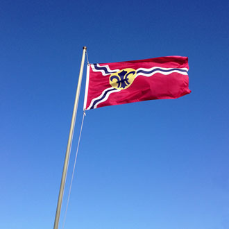
When I was bicycling around south St. Louis a few weeks ago, I noticed the St. Louis city flag flying prominently in front of several private homes. St. Louis pride runs deep in this town, so it makes sense that many fly the flag. I share that pride, but I believe there’s another reason the flag is so popular: It looks really, really good.
Aesthetically, I think it’s one of the best flag designs in use anywhere. I actually sit around and think about ridiculous things like “who has the best flag”, so I’ll take on any challengers to this argument. Unless you live in the United Kingdom or maybe Bhutan, I think the St. Louis flag is better than yours.
Seeing it around town, I started to wonder how it came to be. When was it adopted? Who designed it? How did St. Louis get this minor aspect of their city so right? Turns out, it’s a pretty good story.
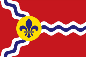
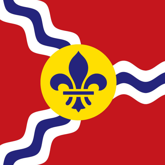
St. Louis’s flag is exceptional for many reasons. It’s simple, it’s unique, it uses just a few basic colors, and it contains several components that symbolize the history of the city. It doesn’t have lettering (it’s difficult to read a waving flag), it doesn’t have a seal (a seal is meant to be seen up close, such as on a document), and maybe best of all, it doesn’t use the image of the Gateway Arch. The St. Louis flag does exactly what it’s supposed to do: It’s a symbol for the city and it’s easy to identify from a distance.
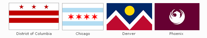
I’m not alone in my opinion. In my initial research for this post, I stumbled upon an organization named the North American Vexillological Association. According to Wikipedia, vexillology is the “scientific study of the history, symbolism[,] and usage of flags or, by extension, any interest in flags in general”. It also seems there are quite a few prominent vexillologists around that take flag design very seriously. In 2004, NAVA held a survey to rank the top 150 American city flags. St. Louis came in fifth, behind Washington D.C., Chicago, Denver, and Phoenix. Personally, I think St. Louis has them all beat. Maybe I need to join NAVA and set things straight.
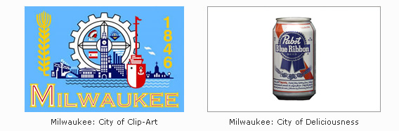
In contrast, take a look at Milwaukee’s flag below. I’d wager not many porches in our fellow beer town are waving this travesty. I thought I’d offer up my own design that I think is a far better representation of that fair city.
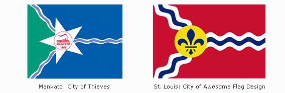
How about Mankato, Minnesota? The folks there must know a thing or two about good flag design. They know the St. Louis flag design is so good, they should just rip it off. Too bad they screwed it up by adding the riverboat, lettering, and a putrid color scheme.
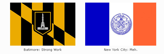
It’s actually only a recent development that American states and cities starting flying official flags. Prior to the 20th century, many believed the United States flag was the only banner needed. Despite this sentiment, Baltimore kicked things off in 1914 by adopting an official city flag, followed by New York City in 1915.
It didn’t take long for St. Louis to join the fun. In 1915, a man named Percival Chubb suggested that St. Louis should design and adopt an official municipal flag. Soon after, a group named the Pageant-Drama Association held a contest, offering $100 to the winning design. The winning design would then be offered to city authorities as an “appropriate city flag”.
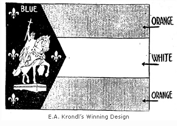
A winning design was announced in January, 1916. The winner was a young St. Louis artist named Edward A. Krondl. It featured a white figure of St. Louis on his horse in front of blue background. Surrounding St. Louis are four fleur-de-lis, representing the Louisiana Purchase and signifying the city of St. Louis as being the fourth-most populated city in the United States. The flag also contained three stripes on the right, signifying Krondl’s idea that St. Louis would soon advance to third place. Â The color blue behind St. Louis represented celestiatlity, the white stripe represented purity and cleanliness, and the two orange stripes represented gold, wealth, and prosperity.
His winning design kicked off quite a debate. Some argued that a flag was no place for a portrait. Percival Chubb complained that the blue was too blue and the orange wasn’t orange enough. He made Krondl change it. Almost everyone agreed that the four fleur-de-lis representing St. Louis as the fourth city was impractical. If St. Louis dropped in the rankings, the flag would need to be redesigned (today, it would need fifty-eight).
The city aldermen were the least impressed, with some even hinting favoritism. Alderman Gus Bauer was accused of promoting Krondl’s design since he represented the area where Krondl lived. In one humorous exchange during the debate, Bauer barked at one of his accusers “What do you know about art? You’re a florist!”.
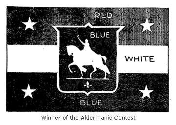
Ultimately, the city aldermen rejected the design and decided to hold a contest of their own. After reviewing over 150 designs, a new winner was announced on May 20, 1916. This time, a young man named A.P. Woehrle was awarded $100 for his winning design. The new design replaced orange with red and centered the image of St. Louis in front of a blue shield. Stars replaced the fleur-de-lis, but surprisingly, they held the same symbolism. St. Louis was to be represented as the fourth city.
It’s not difficult to notice that the two designs are very similar. And that’s where things get interesting. It was soon discovered that the same artist designed both flags. Claiming that he wanted to win on merit and not on the prestige from winning the first contest, Edward Krondl entered his new design under the name of his friend, A.P. Woehrle.
By this point, the aldermen didn’t really care. Except for one alderman who refused to vote for any flag that wasn’t the stars and stripes, they had their flag. To celebrate the new design, the aldermen all hopped on a riverboat and took a ride on the Mississippi with the new flag proudly snapping in the wind.
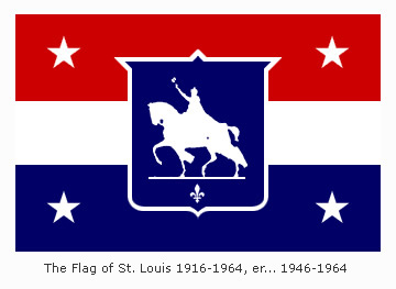
Thirty years later, it was discovered the flag argument wasn’t finished. In 1946, a local man stumbled upon a collection of varying St. Louis flag designs. Unaware of the competitions held in 1916, he walked over to City Hall to see what he could learn. He was startled to discover that St. Louis didn’t have an official flag. After their friendly boat ride promoting the new banner, the aldermen went back to work on other matters. They never bothered to make the new flag official.
An ordinance was quickly passed in 1946 to correct the oversight, but many St. Louisans were now reminded that the design wasn’t very good to begin with. Prominent St. Louisan Charles Nagel, an architect who would come to play a role in the selection of the Gateway Arch design, declared the 1916 flag to be “wretchedly bad in heraldic design”.
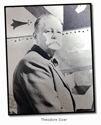
Proponents for a new design became more vocal in the 1950′s. Even the St. Louis Post-Dispatch promoted the idea of a new flag with an editorial in 1957. Eventually, Charles Nagel called upon an acquaintance who had experience designing flags. Theodore Sizer, an art professor at Yale, came to St. Louis and designed the flag that flies in St. Louis today.
Sizer also used specific colors to represent the four empires that have ruled St. Louis:
- Spain – Red and Gold
- Bourbon France – Blue and White
- Napoleonic France – Blue, White, and Red
- The United States – Red, White, and Blue
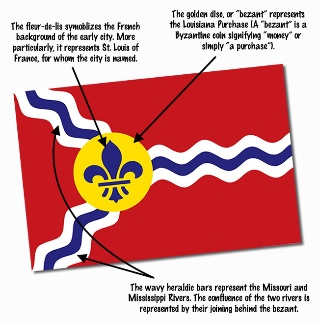
In an article for St. Louis Magazine in October 1964, Sizer explains that designing the flag presented quite a challenge. He was asked to incorporate the history of the city into the design, with references to the Louisiana Purchase, Charles Lindbergh, and even Stan Musial. Most importantly, he was told his design must include the image of St. Louis on his horse.
Fortunately, Sizer had better ideas in mind. In response to using the image of St. Louis, he stated:
“I have nothing against St. Louis, or his white horse, but on a flag it looks like anybody on any horse. Dammit, you look at it and you can’t tell if it’s Saint Louis, King Arthur, or Robert E. Lee.”
To the benefit of St. Louis, he took his design in a completely different direction.
“The one distinctive feature about the city of St. Louis are the rivers, the confluence of the Missouri and the Mississippi. The confluence was the reason for St. Louis being founded by the settlers in the first place.”
Sizer stressed the importance of how the flag would look at a distance. When it was suggested an eagle be included in the design, he responded that it would have “looked like a chicken or some other bird”. Fortunately, he also rejected incorporating the newest of St. Louis symbols.
“And we decided to stay clear of the new Saarinen arch. Would have looked like a chicken wishbone at thirty paces.”
Fortunately, Sizer was able to bring others around to his way of thinking. When the process was complete, Sizer’s design was officially adopted as the St. Louis municipal flag on February 3, 1964.
Theodore Sizer died in 1967. Today, his design can be found flying around the city without a whisper of derision. Eat your heart out, Milwaukee.


Before getting a drink, I thought it’d only be appropriate to get out and buy my own St. Louis flag. For that task, I knew exactly where to go.
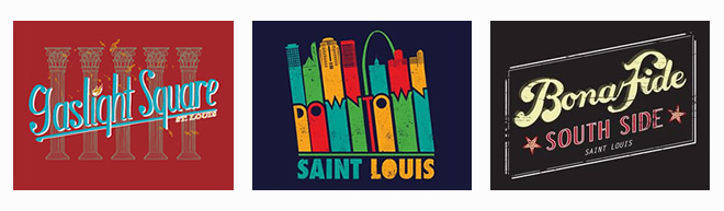
STL-Style is one of the neatest stores in town. Located at 3159 Cherokee Street in Benton Park West, it’s owned and operated by two brothers, Jeff and Randy Vines. Like myself, these guys have a deep pride for St. Louis city. Back in 2001, they decided to make it their mission to create a line of apparel that promotes the city as they saw it.
Twelve years later, that mission has evolved into a unique store filled with fun pro-St. Louis merchandise. They’ve since built a team of artists who create witty and eye-catching designs that promote the city and the neighborhoods in it. It started with t-shirts, but they’ve since expanded to sell prints, bags, mugs, stickers, hats, onesies, and even underwear. The St. Louis flag is available in two sizes, but Sizer’s great design is also available on shirts, bags, and other store items.
It’s a great store for tourists, but the designs are really meant for St. Louisans to promote their city from within. Get down there and check out their inventory. They’ll have something to represent whatever neighborhood you call home.
Their passion goes beyond selling t-shirts. Dig around their website, or simply talk to them, and you’ll discover two guys working to make St. Louis better in many different ways. They are even on the Board of Directors for Landmarks Association of St. Louis, a great organization I mention often in this blog.
 For the record, I’m plugging this place without any kickback from Jeff and Randy. I simply think they have a great store and I appreciate what they are doing. And since it’s tough to tie a flag to a drink, I asked them where to get my drink for this post. They didn’t disappoint. They directed me to the The Fortune Teller Bar, located nearby in the eclectic Cherokee Street neighborhood.

I’d never been to the Fortune Teller, so I was happy to they recommended a place that takes cocktails seriously. As soon as I walked in, I noticed a well-stocked bar with a great selection of spirits. The Fortune Teller also offers a good craft beer selection. As I sat down at the bar, I noticed a bottle of Old Tom’s Gin on the shelf. If a bar has Old Tom’s, it’s going in my belly. With that in mind, I ordered the “Alpine Daisy” off their specialty cocktail menu.
The drink was delicious. Served on the rocks in a highball, it was tart and refreshing. And since it was a dark and stormy night, I followed it up with their version of my beloved Manhattan. Since I know I’ll be returning to the Fortune Teller, I’ll save that review for a future post.

NOTE: In my research for this post, I came across several references to the St. Louis flag being dubbed the “Three Rivers Flag”. These sources claim the Meramec River is also represented as one of three rivers in the design (instead of two). I found no evidence to support this. As Sizer quoted to St. Louis magazine in 1964, the key feature of the design is the confluence of the Mississippi and the Missouri. The Meramec is never mentioned. There is also no mention of the Meramec in the official city ordinance passed in 1964.
Furthermore, putting the Meramec on par with the Mississippi and Missouri is absurd. It also makes no sense in the design. Are the three rivers supposed to be flowing together behind the bezant? So, until someone proves otherwise, don’t call it the “Three Rivers Flag”.

Such a wonderful and well researched blog post. Kudos!
Thanks so much!
Is it me or did the NY Rangers rip off our awful former flag?
Ha! I wish I had thought of that before writing this.
Great article. I drew heavily from Sizer’s flag when I designed the Fair Saint Louis logo. Like Sizer, I did not want the arch in that design, either. I still prefer my initial “archless” design, but the design committee could not be dissuaded.
Great post! I made some high quality graphics of the flag available on my blog a few years ago and Sizer’s grandson commented on that post. You can read it and download the graphics here: http://www.billstreeter.net/free-st-louis-flag-graphics-vector-png-jpg-and-gif/
Vector as well! Thanks so much!
As a fellow design junkie, I was enthralled with this post. Why don’t more flag designers take into consideration how the flags appear from 30+ feet away? That seems like a major oversight. Then again, it sounds like much of these happen by committee/consenus, which can also be the death-knell of quality design. Much love for your research, Cameron.
I’m glad you agree! We always agreed on that stuff though, didn’t we? 😉
When I first visited St Louis some years ago, I saw the flag flying from a riverboat of some sort. I had never seen it before but immediately inferred what it was: the symbolism of the rivers joining at the Bourbon fleur-de-lis was so obvious it couldn’t possibly have been anything else. To me this is genius.
I agree! Such a great design.
I still think Indianapolis has the coolest flag in America because it represents a place. The flag is their downtown street grid and monument. What other city in America can project its flag onto a map?
St. Louis has a cool flag, but it is way underused. Chicago has managed to adapt theirs to buses, police cars, and all sorts of stuff. We need to use that wiggling river more often.
I agree. Indianapolis has a great flag. However, the confluence of the rivers is also an actual place. As Sizer noted, it’s the reason this area was selected for a settlement. And, I agree with you completely that the flag is way underused. Thanks for reading!
Thanks so much for this… I am engaged in a geotourism planning project for the Lewis & Clark National Historic Trail, and this gives some new perspective on the city’s embrace of the mighty Confluence. Like many, I had previously bought into the legend that the flag represented the Meramec as well.
I agree. I sent an inquiry to Metro with just that thought — why NOT go full-bore incorporating the flag’s design into its fleet?! There’s hints of it on there, color-wise, but I’d love to see a paint job running that wiggly white-red design across its length (preferablyy at a 45-60 angle downward).
On Tuesday one of my co-workers remarked that they liked my earrings (fleur-de-lis) and asked if I was from Louisiana (I live in San Antonio). I told him, no, that I was from St. Louis and I loved the fleur-de-lis because it was a tie to my hometown, because there was a fleur-de-lis on our flag. I did a Google search and sent him a link from Wikipedia on the St. Louis flag.
On Wednesday, I’m reading Facebook and I came across this blog post on the Landmarks Association of St. Louis page. Wow!! What a serendipitous moment!!
Great timing and great post. I invite you to check out my blog, http://www.thegroovygringa.com. I often write about growing up in St. Louis. Here’s one post you might like: http://www.thegroovygringa.com/2012/11/a-fascination-with-preservation.html
You guys have a good flag, no two ways around it. However, yet again, Chicago bests you in this too. Ask a thousand people nationally what city each flag represents and Chicago will beat you every day of the week and twice on Sundays.
We can all agree that Milwaukee sucks though.
I think Chicago has a great flag, but respectfully, I don’t believe the design is better than the St. Louis flag. As for how many people could recognize them in some sort of flag identifying contest? That’s meaningless. Chicago is ten times bigger than St. Louis, so more people should be able to identify it.
Thanks for a super write-up. I enjoyed reading your scholarship and learning more about the flag’s history.
When I edited NAVA’s “American City Flags” book in 2004, the writer of the St. Louis entry didn’t include information about the very first proposal.
As the compiler of NAVA’s flag-design guide, “Good Flag, Bad Flag”, I’m delighted to see you invoking the principles of sound flag design in evaluating the St. Louis flag.
And as the coordinator of NAVA’s city flag survey, in which the St. Louis flag’s score put it in 5th place (out of 150 flags rated), I would add that the respondents to the survey included NAVA members and hundreds of others…making it a very broad representation of opinion.
Landing in the top five flags is impressive, and in my opinion it’s not worth arguing about which is the “very best”–St. Louis has a tremendously good flag. We’ll know that the citizens truly adopt it when city flag tatoos start showing up (as they do in Chicago!).
Good work.
Thank you so much for your comment. I must apologize. I completely referred to the principles of good flag design that you detail in your article. Although I had my own pre-exisitng beliefs that run parallel to it, I should have cited your article in some way. Please know I’m still very new at this blogging/writing thing, and I’m learning as I go. I do this just for fun, and I’m shocked at the audience I’ve reached. At any rate, your kind words make my day. Thank you so much.
I never would have predicted that a blog post about a flag could hold my attention for more than 15 seconds. Sure, your impeccable research (especially the interesting connections between U.S. cities) adds to your street cred as a researcher and historian. But damn it — more than all of that — your writing is gorgeous. If I didn’t love you, I’d hate you for it! Keep it up, pal.
but…but…are the rivers on the flag flowing the wrong way?
Only if you insist that north is “up”. Let’s face it, that’s kind of arbitrary, as the map can be turned any old way. And the hoist-to-fly orientation of a flag suggests that the “rivers” look best “flowing” that way too.
I always thought the 3rd river was the Illinois River. Even though our neighboring areas to the East are in a different state, they are still pare of the Greater St. Louis Metropolitan area and share many services with the Missouri side, as also happens with the Greater Kansas City Metropolitan area and it’s shared services to the Kansas lands to the West.
When I look at the “Three Rivers Flag”, I see it as the confluence of the Missouri, Mississippi, and Illinois Rivers, with the yellow circle representing where St. Louis City sits on that stylized “map” of the surrounding area.
Springfield, MO just adopted a new flag. https://sgfflag.org/